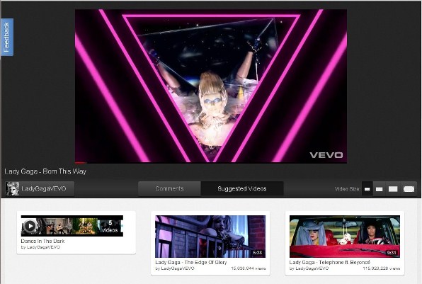
Did you notice the recent changes to YouTube? Google is planning for a total revamp of YouTube and it needs users to try and give them feedbacks. The news was appeared in the YouTube blog.
Cosmic Panda, as Google named it, comes with an elegant looking interface for video, playlists and YouTube channels. Some of the significant changes are;
- An elegant black backdrop of YouTube player, instead of the current white background
- Playlists are totally redesigned and looks beautiful and easy to access
- You can now switch from comments and suggested videos easily by selecting the button below the video player
- Featured playlists are redesigned and looks more polished
- The way Channels are presented is made a lot more beautiful, showing wider images of the video
Check it out for yourself by clicking here and watch your favourite videos. Google says, “We look forward to seeing your feedback and hope you enjoy hanging out with our Cosmic Panda.”
Check out Cosmic Panda in the following images:


Do you find this information useful? Share it with your friends by on Facebook, Google+, Twitter or other Social Media. You can also follow me on Twitter @sarayoo.info or Google+ or Like me on my Facebook or on my LinkedIn for more updates, technology tips and tricks, iPhone, iPad, other iOS devices tips, iOS App Deals, Blogging tips, etc. Please leave your comments in the comment section or contact me if you have any other questions.
